Ars Poetica: The Notations of Pierre Coupey
Paula Gustafson, Curator, Notations 1994–1998, Canadian Embassy Gallery, Tokyo
Notations 1994–1998 presents a selection from the most recent series of paintings and prints from Canadian artist and poet Pierre Coupey. These paintings, encaustic works on paper, and black and white poem/print etchings survey his ars poetica.
Coupey’s work moves uninterrupted across and through the matrices of all three media: most deliberately between poetry and printmaking, most exuberantly with direct painting where his colour gestures are uttered as syllables and notes. In each he explores a philosophical path as modern as it is ancient – the mind comprehending itself through the action of the body.
The genesis of this new body of work within Coupey’s Notations series began in 1993 when he took up residence on Vancouver’s north shore. From high over English Bay his view extends across Burrard Inlet to Point Grey, and across Georgia Strait to Vancouver Island. He speaks of the changing ‘tones’ of weather, the layers of colour and light, the “surprises of this becoming that.” [1]
Although his outward view is geographically situated, Coupey’s ars poetica is the on–going inner journey of a protean individuality, clearly traced in the semiotics of colour and shape, in compulsive mark–making, in randomly scribed, ‘inarticulate’ search maps. In his poem Compass he proposes to write as I paint / layers, mistakes / intent on the tones
II
“the inarticulate thoughts were defined with precision (the sun’s lance coming to rest on the precise spot verbally).” [2]
Variations done for bpNichol 9 (1990), acrylic on canvas, 60 x 48 inches
Permanent collection, University of Lethbridge Art Gallery
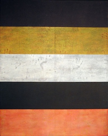
Coupey’s first poems were published in the 1960’s, a revolutionary era when poets discarded conventional closed form structures for ‘open field’ structures, and experimented with visual and sound poetry. Coupey continues to refer to his mentors and companions in that exploration. For example, his 1990 series of paintings, Variations done for bpNichol, is his homage to one of Canada’s most innovative experimental poets. In discussing this work critic and curator Ann Rosenberg explores Coupey’s dual concerns:
The formal merit of Variations lies in Coupey’s orchestration of different arrangements (sequences) of horizontal bands of colour, which, through context, recall the lines of a poem and, through colour (in particular the blacks, browns, and greys) remind one of the gravity of a funeral elegy. On the other hand, the import of the art is deepened by its cognizance of the fact that geometric shapes in varying hues were personalized in the early part of this century by European artists such as Josef Albers and Piet Mondrian.
In Canada in recent years, Guido Molinari and Claude Tousignant—like Coupey—have staked out their claim to the stripe. [3]
The 1960’s were also a fertile period for abstract expressionism—direct painting—and New York might have been a natural choice for Coupey to pursue his career. But in 1964 he left Montreal for Paris to study drawing at the Académie Julian and printmaking with Stanley William Hayter at Atelier 17. When he returned to Canada it was to Vancouver, and in the role of writer and political activist. [4]
At that time visual art in Vancouver was dominated by the region’s superb landscape—a factor that continues to influence even the most non–representational work produced in this Pacific—facing city. Coupey has not been immune to the influence of sea, sky and mountains, to the moody, constantly changing atmospherics, the subtle colourations of West Coast light.
After viewing Coupey’s work in Affinities: Ten Painters of This Region at the Vancouver Art Gallery in 1979, Seattle critic Matthew Kangas wrote: “More and more, as the decade comes to a close, light appears to have been a predominating subject for vanguard abstract painters on the Northwest coast”. Though he works in a brushy mode eschewed by the Seattle artists I am speaking of, Coupey shares with them a distilled, cerebralized relationship to light, local and diffuse.” [5]
Acknowledging Coupey’s paintings as “unquestionably the liveliest” in the Affinities exhibition, Kangas also noted he is “a poet and founding editor of [The] Capilano Review.” Coupey was the literary journal’s editor for over five years during the 1970’s, and then again for three years in the 1990’s, during which time The Capilano Review published new work from writers and artists as compelling as Robin Blaser, Phyllis Webb, Christopher Dewdney, Sharon Thesen, Michael Ondaatje, Tom Burrows and Jerry Pethick, among others. Rosenberg commented on these linkages between art and writing in a 1988 curator’s statement:
Many of Pierre Coupey’s works vibrate with resonant primary colours, while others are conceived of in tones of grey to black. We are reminded of the rigorous hues of Mondrian’s art and of certain aspects of the Quebec artist Paul–Emile Borduas. Coupey was thinking of an Ezra Pound poem when he painted the brown/grey work called Envoi. This 1983 acrylic is […] typical of some of the abstract canvases that characterize the series […] inspired by the import of the words and lives of modern writers Coupey has empathy with. [6]
Envoi (1985), acrylic & charcoal on canvas, 90 x 76 inches
Private collection, West Vancouver
III
For Coupey, the interchange between words and images is fertile ground for investigating parallel modes of thought and expression.
I always knew I wanted to write and paint. […] The poetry dominated at first, but I always wanted to find some way of getting the two together more completely, without one imitating the other. [7]
A typical crossover can be found in the poem/print, Requiem Notations VII, where Coupey writes of “the shapeliness of / the day // pink cherry blossoms / white magnolia,/ one glimpse of the green / world outside / the window.” Here we are not only given a visual image, but also the elegance of the vision, its ‘shapely’ architecture, its double anchoring in nature and the poet’s eye. Cutting Out the Tongue, the manuscript in which these new poems appear, takes its title from Matisse’s statement in Jazz: “He who wants to dedicate himself to painting should start by cutting out his tongue.” Coupey again affirms his interest in the quietness, the wordlessness of painting:
Ellsworth Kelly, for example, is an important painter to me because there is a fine elegance of shaping in his work, an accuracy of what sort of colour and light will work with what shape. I’m also interested in that kind of discrimination, the very small things, sometimes the smallest curve off the rectangle, and it has to be quiet. […] [8]
With poetics as the basis for exploration, we might see Coupey’s painting not as “emotion recollected in tranquility,” as Wordsworth defined poetry, but as emotion parsed in colour. Orchestrated with the linearity of calligraphy, these painted ‘fields of vibration’ with their arabesque markings transcribe the structure of language, implying a sequence of characters not in any alphabet. Like the peculiar annotations used in dance choreography or in electronic graphing of bird song on heat sensitive paper, Coupey’s paintings document both gesture and interval. Vancouver artist Alan Wood stated that Coupey’s paintings have “an unerring ability to build, span, link and stack a range of forms which are like the girders, posts, beams, blocks and scaffolding which are present in great architecture and sculpture.” [9]
IV
Coupey’s large–scale encounters with the canvas produce works that speak of the direct engagement of the painter and his materials; they make it clear that he sees painting as a verb, a physical activity. [10]
The strength of direct painting is its ability to contain a vocabulary of interpretations. The inverse of kanji ideography [11], abstract imagery is open to multiple meanings. So, too, are Coupey’s marriage of poetry and printmaking in the Requiem Notations series. However, their presentation – the Janus–like portrayal of words and images – displays a formality of thought an intentional structuring based on intelligence. They demand to be grasped as well as sensed.
Many of these prints are among Coupey’s most measured pieces. In contrast to the paintings which seethe with colour energy – imprisoned dark masses – brilliant turquoise forced to compete with vermilion – a chalky white escaping, floating free – the monochromatic printed images often appear meditative, calm. And yet in some plates it seems as if the poet who welcomes pauses, who builds poems with space to exhale and inhale, shifts 180 degrees and suddenly fears leaving white space on the paper. Here we graphically see Coupey’s struggle to use intellect and be rid of it at the same time. He insists on economy of line, precision of form, and then, as he so often does in the paintings, betrays his orderliness by coming back, to improve, erase, elaborate.
These paintings and prints from the Notations series articulate a restless imagination for which no single form or medium suffices. In resistance to the trends toward narrower and narrower specialization, toward closures of the imagination through emphasis on intention and commodification, toward the elimination of textured, tactile, ambiguous space, Coupey remains committed to the disciplines of his media, to record “the score of a man’s / struggle to stay with / what is his own, what / lies within him to do.” [12]
Notes
1. Pierre Coupey, personal communication, 8 January 1998.
2. Ezra Pound, Cheng Ming: A New Paideuma
3. Ann Rosenberg, review of Variations done for bpNichol, Vancouver Sun 1 December 1990: D11.
4. In 1968 Coupey was a founding co–editor of The Georgia Straight.
5. Matthew Kangas, “Chromatic Abstractionists: Vancouver Painting of the 70’s,” Vanguard 10 (December 1979/January 1980): 14–19.
6. Ann Rosenberg, Pierre Coupey and Harry Stanbridge: Recent Works, Surrey Art Gallery, 1988.
7. Interview with Pierre Coupey, 14 November 1997.
8. The same.
9. Alan Wood, preface to Pierre Coupey: New Work 1980–1981, catalogue, North Vancouver: Presentation House Gallery, 1981.
10. Susan Mertens, “Splashin’ Passion,” Vancouver Sun 16 May 1981: B1.
11. Kanji are Chinese logographs; each character represents a tangible object or an abstract concept, emotion or action.
12. John Wieners, “Poem for Painters,” The Hotel Wentley Poems, San Francisco: Auerhahn, 1958.
Paula Gustafson was Editor of Artichoke: Writings about the Visual Arts. From her base in Vancouver she curated exhibitions and published extensively.
Copyright © Estate of Paula Gustafson / Artichoke